버튼을 클릭 시 CSS style이 바뀌게 하는 방법을 알아보자!
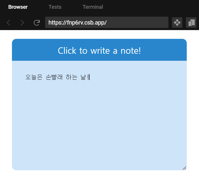
만들 예제의 완성본
메모장 작성 버튼을 누르면, 메모장을 작성하게 할 수 있는 textarea가 펼쳐지게 하는 예제를 만들어볼 것이다.
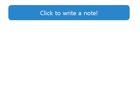
1. 기본적인 마크업을 해서 메모장을 만든다.
Toggle.jsx 라는 컴포넌트를 만들고, 여기에 Toggle.css 파일을 import해서 style을 적용한다.
그리고 App.js 에 Toggle.jsx 컴포넌트를 import해서 렌더링한다.
Toggle.jsx
import "./Toggle.css";

export const Toggle = () => {
  return (
    <div>
      <div className="container">
        <button type="button" className="toggle-button">
          Click to write a note!
        </button>
        <textarea className="text-box" />
      </div>
    </div>
  );
};
Toggle.css
.container {
  width: 400px;
  height: 300px;
  margin: 20px;
  border-radius: 10px;
}

.toggle-button {
  all: unset;
  width: 400px;
  height: 50px;
  background-color: #2986cc;
  color: white;
  border-radius: 10px 10px 0px 0px;
  text-align: center;
  font-size: 20px;
  cursor: pointer;
}

.text-box {
  background-color: #cee4f9;
  width: 400px;
  height: 250px;
  padding: 30px;
  border: none;
  box-sizing: border-box;
  border-radius: 0 0 10px 10px;
  text-align: left;
  resize: none;
}

.text-box:focus {
  outline: 0;
}
App.js
import { Toggle } from "./Toggle";

export default function App() {
  return (
    <div>
      <Toggle />
    </div>
  );
}
2. state를 생성하고, toggle함수를 만들어서 state를 true/false로 변경하게 만든다.
완성된 코드
(전체 코드 밑부분에 이 코드에 대한 자세한 설명이 있습니다)
Toggle.jsx
import { useState } from "react";
import "./Toggle.css";

export const Toggle = () => {
  const [showNote, setShowNote] = useState(false); //초기에 숨김 상태

  const toggleNote = () => {
    // state를 반대로 바꿔주는 함수
    setShowNote(!showNote);
  };

  return (
    <div>
      <div className="container">
        <button
          type="button"
          className={`${"toggle-button"} ${showNote ? "show-note" : ""}`}
          onClick={toggleNote} // 버튼 클릭시 toggle 함수 호출
        >
          Click to write a note!
        </button>
        <textarea className={`${"text-box"} ${showNote ? "show-note" : ""}`} />
      </div>
    </div>
  );
};
Toggle.css (toggle에 따라 스타일을 바뀌게 하기 위해 class를 추가했다)
.container {
  width: 400px;
  height: 300px;
  margin: 20px;
  border-radius: 10px;
}

.toggle-button {
  all: unset;
  width: 400px;
  height: 50px;
  background-color: #2986cc;
  color: white;
  border-radius: 10px;
  text-align: center;
  font-size: 20px;
  cursor: pointer;
}

.toggle-button.show-note {
  border-radius: 10px 10px 0px 0px;
}

.text-box {
  display: none;
}

.text-box.show-note {
  display: block;
  background-color: #cee4f9;
  width: 400px;
  height: 250px;
  padding: 30px;
  border: none;
  box-sizing: border-box;
  border-radius: 0 0 10px 10px;
  text-align: left;
  resize: none;
}

.text-box:focus {
  outline: 0;
}
코드 순서 및 설명
(1) 초기값을 false로 설정하여 숨김상태로 만든다.
const [showNote, setShowNote] = useState(false);
(2) showNote 상태를 반대로 바꿔주는 toggleNote라는 함수를 만든다.
const toggleNote = () => { setShowNote(!showNote) };
(3) <button>에 onClick 이벤트를 달아서, 버튼을 누를 때 toggleNote 함수를 호출하게한다.
<button
     type="button"
     className="toggle-button"
     onClick={toggleNote} // 버튼 클릭시 toggle 함수 호출
>
     Click to write a note!
</button>
(4) <textarea>가 버튼을 클릭할때마다 펼쳤다 접혔다 해야하므로, display:block과 display:none 스타일을 왔다갔다 해야한다.
<textarea className={`${"text-box"} ${showNote ? "show-note" : ""}`} />
showNote 상태의 초기값 → false = 접힌 상태 → display: none
showNote 상태가 toggleNote함수를 통해 반대로 바뀐값 → true = 펼쳐진 상태 → display: block
이렇게 만들어야하므로, 삼항연산자를 통해 showNote 상태(불린값)에 따라 className(스타일)이 다르게 적용되게끔 해야한다.
기존 클래스 네임: text-box
showNote가 false라면, (접힌 상태면) 클래스 네임은 ("" 빈문자열이므로, 기존상태 그대로) .text-box가 된다.
 .text-box {
  display: none;
 }
showNote가 true라면, (펼쳐진 상태면) 클래스 네임은 .text-box.show-note가 된다.
 .text-box.show-note {
  display: block;
  background-color: #cee4f9;
  width: 400px;
  height: 250px;
  padding: 30px;
  border: none;
  box-sizing: border-box;
  border-radius: 0 0 10px 10px;
  text-align: left;
  resize: none;
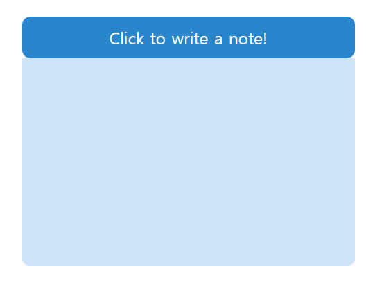
(5) 여기까지 하면, 이렇게 되는데, 오른쪽과 같이 펼쳤을 때 버튼 밑 부분이 border-radius가 안없어지는 문제가 생긴다. 따라서 버튼에도 toggle에 따라 스타일을 변경하도록 해줘야한다.

 <button
  type="button"
  className={`${"toggle-button"} ${showNote ? "show-note" : ""}`}
  onClick={toggleNote} // 버튼 클릭시 toggle 함수 호출
 >
기존 클래스 네임: toggle-button
showNote가 false라면, (접힌 상태면) 클래스 네임은 ("" 빈문자열이므로, 기존상태 그대로) .toggle-button이 된다.
border-radius: 10px → 전체 모서리 다 둥글게 적용
 .toggle-button {
  all: unset;
  width: 400px;
  height: 50px;
  background-color: #2986cc;
  color: white;
  border-radius: 10px;
  text-align: center;
  font-size: 20px;
  cursor: pointer;
 }
showNote가 true라면, (펼쳐진 상태면) 클래스 네임은 .toggle-button .show-note가 된다.
border-radius: 10px 10px 0px 0px → 왼쪽 밑, 오른쪽 밑 모서리는 뾰족하게 적용
 .toggle-button.show-note {
  border-radius: 10px 10px 0px 0px;
 }
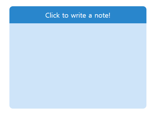
3. 완성된 모습

'Libraries > React' 카테고리의 다른 글
| [React] 버튼을 클릭시 모달창(팝업창) 컴포넌트 뜨게 하기, 닫기(취소) 버튼 누르면 없어지게 하기, useState props로 전달하기 , props 사용하여 state를 다른 컴포넌트로 전달하기 (3) | 2023.11.02 |
|---|---|
| [React] 게시글 더보기, 접기 토글 버튼 만들기 (6) | 2023.11.01 |
| [React] 프로필 사진 업로더 만들기, 프로필 변경/삭제/추가, 프로필 페이지 만들기 (4) | 2023.10.27 |
| [React] useReducer를 코드에 적용하기 (emotion diary 프로젝트 2탄) (1) | 2023.10.25 |
| [React] useReducer로 복잡한 상태변화 로직을 컴포넌트로부터 분리하기 (0) | 2023.10.25 |


